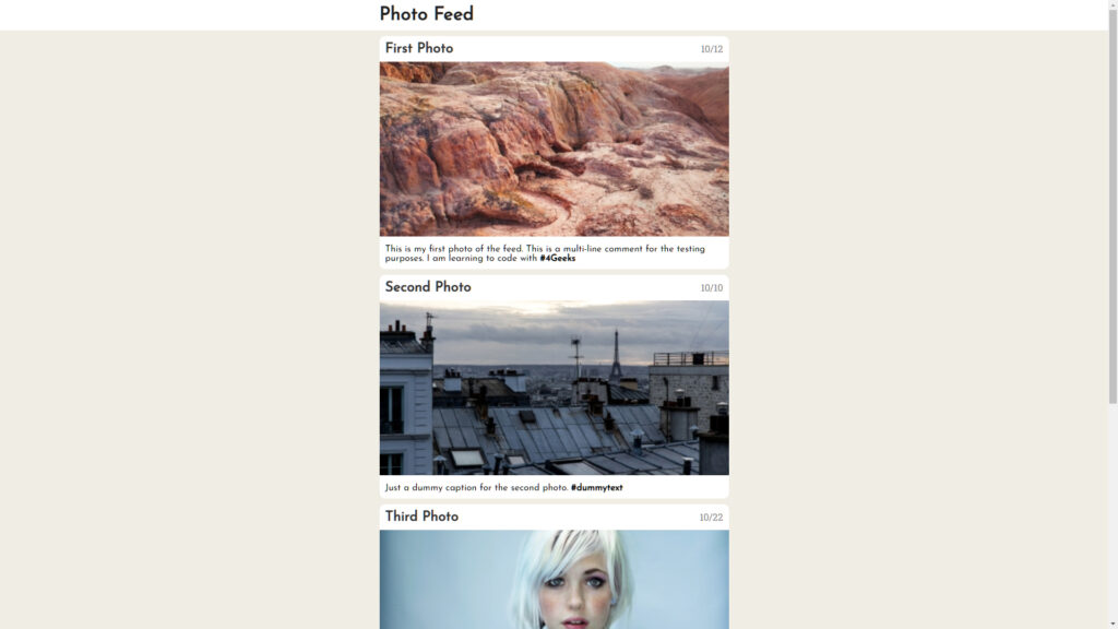
While learning HTML and CSS, our second project was to create a simple photo feed. It was nothing too difficult. The main purpose of it was to get comfortable designing web pages. Again, as with the previous project from 4Geeks Academy, we were provided some instructions; however, we were still encouraged to play around with the code on our own.
Languages: HTML, CSS
Links: GitHub | View Project
Let me explain how I was making this project.
Photo Feed: HTML5
First, let’s start with the HTML section, so I won’t be jumping back and forth.
As per usual, let me show you the <head></head> section:
<head>
   <title>Instagram Feed</title>
   <link rel="stylesheet" type="text/css" href="styles.css">
   <link rel="preconnect" href="https://fonts.googleapis.com">
   <link rel="preconnect" href="https://fonts.gstatic.com" crossorigin>
   <link href="https://fonts.googleapis.com/css2?family=Dosis:wght@300&family=Josefin+Sans&display=swap" rel="stylesheet">
</head>
As you can see from the code above, I set the title of the index.html as “Instagram Feed” first. Then I connected the stylesheet styles.css. Finally, I connected the Google Fonts in order to stop browsers from guessing what look I want.
The <BODY>
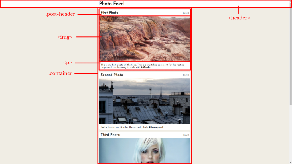
Before I will start explaining every piece of the <body></body> tag let me show you the breakdown in this picture:
As you can see, the main header of the page was locked in the <header></header> tag, then I had a <div></div> tag with the class .container; it will “contain” all of the posts on the page. Eventually, every post will have three main <div></div> tags for the header (with the class .post-header), image (<img>), and caption (with the <p></p> tag).
The <header></header> tag will have another <div></div> inside of it with the class .container. And that <div></div> will have the <h1></h1> tag with the main header of the page.
Take a look at it here:
<header>
   <div class="container">
      <h1>Photo Feed</h1>
   </div>
</header>
After the Header
Now let’s take a look at the page after the <header></header>.
As I mentioned earlier, the main <div></div> tag with the .container class contains all of the posts in it.
Then I have a post containing three pieces: header, image, and paragraph. After that, I simply duplicated the posts.
Let’s take a look at the code with just one post in it:
<div class="container">
   <div class="post">
      <div class="post-header">
         <div>
            <h2>First Photo</h2>
         </div>
         <div>
            <span>10/12</span>
         </div>
      </div>
      <div>
         <img src="http://placeimg.com/400/200/nature"></img>
      </div>
      <div>
         <p>This is my first photo of the feed. This is a multi-line comment for the testing purposes. I am learning to code with <strong>#4Geeks</strong></p>
      </div>
   </div>
</div>
As you can see in this example, the class .post contains the whole post in it and the class .post-header contains the header. The header contains two <div></div> tags that will be aligned into a line with CSS later on. I also wrapped the date of the post into a <span></span> tag.
I also have some “hashtags” (in a few posts) that I wrapped in <strong></strong> tags to make them bold.
Photo Feed: CSS3
Now, let’s look at the CSS file and break it down as well.
In here we can see that the <body></body> tag has a background HEX of #F0EDE4 and no margins:
body {
    background: #f0ede4;
    margin: 0;
}
Moving down further in the code, we can see the CSS for <div></div>:
div {
    -webkit-box-sizing: border-box;
    -moz-box-sizing: border-box;
    box-sizing: border-box;
}
This code was simply copy-pasted from the internet to avoid any alignment issues that might happen. If you want to read more about box-sizing, you can find a good post here. And this is a copy-pasted explanation of border-box:
border-box tells the browser to account for any border and padding in the values you specify for an element’s width and height. If you set an element’s width to 100 pixels, that 100 pixels will include any border or padding you added, and the content box will shrink to absorb that extra width.
When it comes to the CSS for the header, here’s the code I used:
header {
    padding: 10px;
    background: white;
}
I just set a padding of 10px and made the background white. That’s it.
The Details
Let’s dig into more details since I explained all of the main pieces of the page.
First, let me show you the <h1></h1> code on the CSS side:
header h1 {
    margin: 0;
    font-family: 'Josefin Sans', sans-serif;
    color: #1f1f1f;
}
As you can see, I set the margin to 0, set the Google Font to Josedin Sans, and finally gave it a HEX color of #1F1F1F.
Designing the Post
Further, I have played a bit with the .post class of the <div></div> tag:
div.post {
    background: white;
    margin-top: 10px;
    margin-bottom: 10px;
    border-radius: 10px;
}
It only features the white background of the post as well as 10px margins on top and bottom with a border radius of 10px as well (to make the rounded corners).
I also set the width of the image to 100% using this piece of code:
div.post img {
    width: 100%;
}
Then I have the color to the header of the photo:
div.post h2 {
    color: #333333;
}
Besides, I slightly aligned the <p></p> tag (and the photo header at the same time):
div.post h2, div.post p {
    padding: 10px;
    margin: 0;
    font-family: 'Josefin Sans', sans-serif;
}
And using this CSS code I played with the photo header and header date:
div.post .post-header div:first-child {
    display: inline-block;
    width: 80%;
}

div.post .post-header div:last-child {
    display: inline-block;
    width: 20%;
    text-align: right;
    padding: 10px;
    color: grey;
}
If you would like to read more about inline-block, you can find the information here.
Container Class
Do you remember the .container class from the HTML side? Well, its width was set at 600px with the margin auto, so it could be centered:
div.container {
    width: 600px;
    margin: auto;
}
Bonus
By the way, I didn’t use my personal photos in this project. Instead, I used the service PlaceIMG which generates dummy images for you.
All of the images are 400x200px, and you might see them in HTML. Here’s an example of one photo:
<img src="http://placeimg.com/400/200/nature"></img>Conclusion
I hope, I made it clear in this post what steps I was taking while designing this photo feed. If you have any questions, feel free to leave a comment below.
Update
Unfortunately, PlaceImg stopped serving images, so I updated the code with LoremFlickr now.


It’s an amazing job done
Im also a junior frontend developer.
Are you a programmer?
That is what I’m currently learning =)
Wow…. So i can be getting some pdf and job offers