In this post, I’d like to talk about the Bootstrap project that I was working on while attending 4Geeks Academy. After learning about HTML and CSS, I found out that there’s a simpler way to make the pages responsive to different screen sizes. Bootstrap is the most common framework that is currently being used across the internet. So, in this project, I will explain how I made an Instagram feed with Bootstrap.
Languages: HTML, CSS
Frameworks: Bootstrap
Links: GitHub | View Project
Bootstrap is a very fascinating framework. It simplifies everything when one is developing web applications. Pretty much, instead of writing the CSS from scratch every time one is trying to create responsive web pages, they can simply connect Bootstrap and use their large database of documentation to set up almost everything they need.
When you need to make some changes in the CSS yourself though, you can link your HTML to it AFTER the link to the Bootstrap. Or, you can use the !important parameter (which I always use) in order to override the framework’s settings.
And, by the way, Bootstrap was created by Twitter employees way back in 2011.
Instagram Feed With Bootstrap: The Breakdown
First of all, I wanted to note that I used photos from Pexels in this project. I also made square versions of them (in Photoshop).
This project includes two HTML files for different looks of the feed: index.html and list.html. It also uses a rather short CSS file.
I tried using a lot of comments in the HTML code in order to be able to easily navigate it in the future. Let’s begin with the <head></head> tag.
HEAD
First, let me show you the code for the <head></head> here and later I’ll explain everything I’ve done there:
<head>
  <meta charset="UTF-8">
  <meta http-equiv="X-UA-Compatible" content="IE=edge">
  <meta name="viewport" content="width=device-width, initial-scale=1.0">
  <!-- Connecting Roboto font -->
  <link rel="preconnect" href="https://fonts.googleapis.com">
  <link rel="preconnect" href="https://fonts.gstatic.com" crossorigin>
  <link href="https://fonts.googleapis.com/css2?family=Roboto&display=swap" rel="stylesheet">
  <!-- Connecting Bootstrap CSS -->
  <link href="https://cdn.jsdelivr.net/npm/bootstrap@5.2.2/dist/css/bootstrap.min.css" rel="stylesheet"
    integrity="sha384-Zenh87qX5JnK2Jl0vWa8Ck2rdkQ2Bzep5IDxbcnCeuOxjzrPF/et3URy9Bv1WTRi" crossorigin="anonymous">
  <!-- Connecting Font Awesome because why not-->
  <script src="https://kit.fontawesome.com/d40adb1550.js" crossorigin="anonymous"></script>
  <!-- Connecting styles.css -->
  <link rel="stylesheet" href="styles.css">
  <title>Photo Feed - Grid</title>
</head>
As you can see in lines 5 through 8, I’m connecting a Roboto font from Google. It’s also connected via my local CSS file:
body {
    font-family: 'Roboto', sans-serif !important;
}
In lines 9 through 11 I’m connecting the CSS of Bootstrap.
Lines 12 and 13 will connect us to Font Awesome icons for future use.
Finally, lines 14 and 15 will connect our own local CSS file if we want to make some additional style adjustments.
Just to note, the <head></head> will look almost the same in the list.html file. There will be a difference in the <title></title> tag only.
Index Body Tag
Now, let’s talk about the index.html‘s <body></body> tag.
Majority of the class parameters that I used there I was able to find through the Bootstrap documentation. I found that it’s impossible to learn all of the classes by heart, and it is much easier just to copy and paste everything that’s needed when it’s needed.
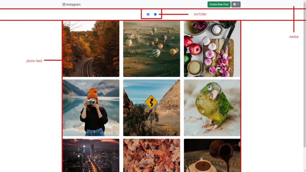
This is a breakdown of the page:
As you see, it has a navbar, a switcher, and a photo feed.
Navbar
The navbar has multiple pieces included in it such as a logo, a button, a menu, and a modal (a pop-up window that appears after you press a certain button).
This is the code for the navbar only:
<nav class="navbar navbar-expand-lg bg-light">
    <div class="container-fluid mx-auto" style="width: 60%;">
      <button class="navbar-toggler" type="button" data-bs-toggle="collapse" data-bs-target="#navbar"
        aria-controls="navbar" aria-expanded="false" aria-label="Toggle navigation">
      <span class="navbar-toggler-icon"></span>
      </button>
    </div>
</nav>
You can refer to the Bootstrap documentation to learn what each class within the <nav></nav> and <div></div> tags means.
This is the HTML line I used for the logo:
<a class="navbar-brand" href="#"><i class="fa-brands fa-instagram"></i> Instagram</a>As you might notice, I used Font Awesome to get the Instagram logo.
I had to add some empty space between the logo and the buttons to the navbar using this line of code:
<div class="navbar-nav me-auto mb-2 mb-lg-0"></div>The right part of the navbar contains a modal button:
<button type="button" class="btn btn-success" data-bs-toggle="modal" data-bs-target="#newPost">
    Create New Post
</button>
Then I placed the modal itself (with the form):
<div class="modal fade" id="newPost" tabindex="-1" aria-labelledby="modalLabel" aria-hidden="true">
     <div class="modal-dialog">
          <div class="modal-content">
               <div class="modal-header">
                  <h1 class="modal-title fs-5" id="modalLabel">Create a New Post</h1>
                  <button type="button" class="btn-close" data-bs-dismiss="modal" aria-label="Close"></button>
               </div>
           <!-- Modal form -->
               <div class="modal-body">
                  <label for="caption" class="form-label">Caption</label>
                  <textarea class="form-control" id="caption" rows="3"></textarea><br>
                  <button type="button" class="btn btn-outline-dark"><i class="fa-solid fa-camera"></i></button>
                  <button type="button" class="btn btn-outline-dark"><i class="fa-solid fa-location-dot"></i></button>
               </div>
           <!-- End modal form -->
               <div class="modal-footer">
                  <button type="button" class="btn btn-secondary" data-bs-dismiss="modal">Close</button>
                  <button type="button" class="btn btn-success">Publish</button>
               </div>
          </div>
     </div>
</div>
You may see the code for the modal form in lines 8 through 15. Again, I used some Font Awesome icons for the buttons.
Also, in this Instagram feed with Bootstrap I created a dropdown menu using this HTML code:
<div class="dropdown">
     <a class="btn btn-secondary dropdown-toggle" href="#" role="button" data-bs-toggle="dropdown"
      aria-expanded="false">
     <i class="fa-solid fa-gear"></i>
     </a>
     <ul class="dropdown-menu">
        <li><a class="dropdown-item" href="#">Profile</a></li>
        <li><a class="dropdown-item" href="#">Accessability</a></li>
        <li><a class="dropdown-item" href="#">Privacy and Data</a></li>
        <li>
         <hr class="dropdown-divider">
        </li>
        <li><a class="dropdown-item text-danger" id="log-out" href="#">Log Out</a></li>
     </ul>
</div>
You might notice, that I used an id #log-out in the last menu option. I utilized that function in the CSS using this code:
#log-out:active {
    color: white !important;
    background-color: red !important;
}
When someone would click on that item, it would get a background color of red and font color of white. You might notice that I put !important next to those parameters in case Bootstrap will try to overwrite them.
This is pretty much the whole HTML of the navbar. Now, let’s take a look at the switcher.
The Switcher
This code of the Instagram feed with Bootstrap is rather simple. Here’s what it looks like:
<div class="m-3 d-grid gap-2 d-md-block text-center">
    <button class="btn btn-link" type="button" onclick="document.location='index.html'"><i class="fa-solid fa-table-cells"></i></button>
    <button class="btn btn-link" type="button" onclick="document.location='list.html'"><i class="fa-solid fa-square"></i></button>
</div>
As you can see it just switches the page from index.html to list.html. Again, I used the Font Awesome icons here. Besides, the icons act as buttons and not links. You can see it by “onclick=”document.location=“.
Photo Grid of the Instagram Feed With Bootstrap
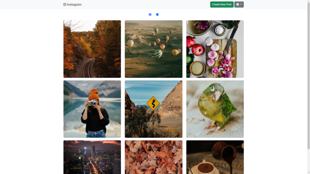
The photo feed here represents a 3 by 3 grid of squared photos. And the code for it couldn’t be easier. It is three class=”row” of divs that include three class=”col” of divs each. Here’s what it looks like:
<div class="container-fluid d-grid gap-3" style="width: 60%;">
    <div class="row">
      <div class="col"><img src="./pics/trees.jpg" class="rounded" style="width:100%"></div>
      <div class="col"><img src="./pics/baloons.jpg" class="rounded" style="width:100%"></div>
      <div class="col"><img src="./pics/food.jpg" class="rounded" style="width:100%"></div>
    </div>
    <div class="row">
      <div class="col"><img src="./pics/girl.jpg" class="rounded" style="width:100%"></div>
      <div class="col"><img src="./pics/sign.jpg" class="rounded" style="width:100%"></div>
      <div class="col"><img src="./pics/parrot.jpg" class="rounded" style="width:100%"></div>
    </div>
    <div class="row mb-3">
      <div class="col"><img src="./pics/city.jpg" class="rounded" style="width:100%"></div>
      <div class="col"><img src="./pics/leaves.jpg" class="rounded" style="width:100%"></div>
      <div class="col"><img src="./pics/coffee.jpg" class="rounded" style="width:100%"></div>
    </div>
</div>
Honestly, at first, I tried to set col-4 classes, but they would create fixed columns that would mess everything up. I left them as simple cols. Of course, I included relative paths for the pictures, so I could move this directory anywhere.
Connecting JavaScript
Surely, I connected the Bootstrap’s JavaScript file right at the end of the <body></body> hashtag:
<script src="https://cdn.jsdelivr.net/npm/bootstrap@5.2.2/dist/js/bootstrap.bundle.min.js"
    integrity="sha384-OERcA2EqjJCMA+/3y+gxIOqMEjwtxJY7qPCqsdltbNJuaOe923+mo//f6V8Qbsw3"
    crossorigin="anonymous">
</script>
list.html
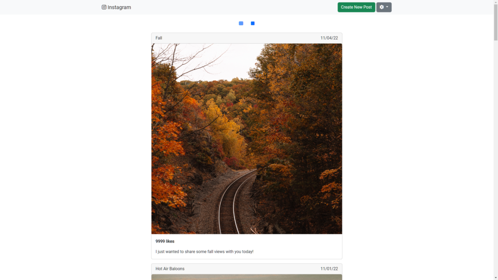
The list.html file is the second HTML that gives us a list view of the feed. Honestly, most of it looks exactly the same as index.html.
In this file I created a list of photos that is taking 40% of the page’s view using this tag:
<div class="container-fluid d-grid gap-3" style="width: 40%;"></div>This <div></div> has multiple other divs one by one. Each of those divs represents a photo. Let me show you one of those photos here:
<div class="card">
     <div class="card-header">
         <div class="row">
             <div class="col">
               Fall
             </div>
             <div class="col text-end">
               11/04/22
             </div>
          </div>
     </div>
     <img src="./pics/trees.jpg" class="card-img-top">
     <div class="card-body">
         <p class="card-text"><strong>9999 likes</strong></p>
         <p class="card-text">I just wanted to share some fall views with you today!</p>
     </div>
</div>
I used the card feature of Bootstrap to show these photos.
This card has a top row that contains the name of the picture as well as a date. Going further, we can see the <img> for the image itself. And, finally, we have the card body that contains two paragraphs: one with the number of likes, and another one with the description of the picture.
I just duplicated this card eight more times in order to show the other eight photos.
Conclusion
As soon as you understand how to utilize Bootstrap’s documentation, creating HTML gets very easy. Also, I found that Google might lead to other Bootstrap resources that can provide additional useful information.
Bootstrap is an amazing framework that really simplifies creating responsive web pages that are suitable for various screen sizes.
As per usual, feel free to leave any comments or questions!


