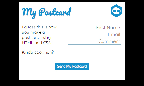
During the time spent at 4Geeks Academy, one of our first projects was to create a non-interactive digital postcard using only HTML and CSS. Although the boot camp provided us with instructions, we still had to add some creativity to it. It was the first project during the program.
Languages: HTML, CSS
Links: GitHub | View Project
I did play around with the color schemes and fonts which added some of my unique touches to the final project.
The digital postcard was built using only two files: index.html and styles.css. The HTML file was made to create the outline of the project while the CSS file was responsible for the style (surprise!).
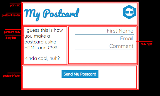
Here is the outline of the postcard:
Body Tag
If you open the code, you will notice that the <body> tag is only responsible for the background and fonts while the whole body of the digital postcard is locked in a <div> tag with a class “.postcard“.
That is how the “.postcard” class looks in the CSS:
.postcard {
	background-color: white;
	width: 400px;
	height: 300px;
	margin: auto;
}
I used a white background with a fixed width of 400 px and height of 300px. The “margin: auto” property centered the card horizontally.
Here’s the CSS side of the <body> tag:
body {
	background: black;
	font-family: "Pacifico", cursive;
	font-family: "Quicksand", sans-serif;
}
The “font-family” property has to be matched in HTML with the tag that is calling for the specific Google font. That’s how it looks:
<link rel="preconnect" href="https://fonts.googleapis.com" />
<link rel="preconnect" href="https://fonts.gstatic.com" crossorigin />
<link href="https://fonts.googleapis.com/css2?family=Pacifico&family=Quicksand&display=swap" rel="stylesheet" />
As you can see in line 3, we are calling for two fonts, Pacifico and Quicksand. The first one was used in the header, while the second one was used in the body of the card itself. You don’t really need to call the header in the body, but that’s just how I did it.
Header
The Pacifico font goes into the <h1> tag:
.postcard-header h1 {
	width: 100%;
	margin: 0;
	font-family: "Pacifico", cursive;
	color: #148fcb;
}
Also, using the eyedropper tool in Photoshop and applying it to the logo, I was able to get the HEX color code. This way I was able to match the header color to the logo color. I also applied 0-margin and 100% width to the <h1> as you can see in the CSS.
I gave a 50x50px size to the header image using this code:
.postcard-header img {
	width: 50px;
	height: 50px;
}
And, by the way, the whole header itself uses the parameter “display:flex” to make the DIVs inside of it go horizontally instead of vertically; plus it features a 10px padding to have some room on the sides for a better look.
.postcard-header {
	display: flex;
	padding: 10px;
}
Digital Postcard Body
I also used the “flex” on the body of the card:
.postcard-body {
	display: flex;
}
As you can see in the HTML, it has two DIVs inside of it to make the text side of the card on the left and the form side on the right:
<div class="postcard-body">
				<div class="body-left">
					<p>I guess this is how you make a postcard using HTML and CSS!</p>
					<p>Kinda cool, huh?</p>
				</div>
				<div class="body-right">
					<input type="text" placeholder="First Name" />
					<input type="text" placeholder="Email" />
					<input type="text" placeholder="Comment" />
				</div>
			</div>
The left side also uses two paragraphs, and the right side has three input fields in it.
This CSS code gave a top margin of 0 to the first paragraph in the “.body-left” to make sure there won’t be any issues with the alignment:
.body-left p:first-child {
	margin-top: 0;
}
Using this CSS, I gave 10px paddings to the two sides of the body:
.body-left,
.body-right {
	padding: 10px;
}
I had some issues with the font in the input section because it didn’t want to match the <body> settings that were set in CSS. But after adding a few parameters to the <input> tag through CSS, the problem was fixed.
input {
	border: none;
	border-bottom: 1px #8cb3c6 solid;
	font-family: "Quicksand", sans-serif;
	font-size: large;
	text-align: right;
}
I only left the bottom part of the border and did a few fixes to the general look of the form itself. It’s quite clear to see in the CSS.
Footer
Now, let’s get to the footer section:
<div class="postcard-footer">
	<button><strong>Send My Postcard</strong></button>
</div>
It is just a simple button where I made the writing in it look bold using the <strong> tag. The rest was accomplished via the CSS.
I centered the whole footer:
.postcard-footer {
	text-align: center;
}
Then, I played a bit with the button:
button {
	background-color: #148fcb;
	padding: 5px 7px;
	border: none;
	font-family: "Quicksand", sans-serif;
	color: white;
}
Here I was able to set the background color to match everything. Also, I set the padding, removed the border, used the desired font, and made that font white.
To make the button in the postcard a bit more interactive, I used the “:hover” parameter to change the color slightly when you are about to press it:
button:hover {
	background-color: #3797c7;
}
Finally, I added some padding to the footer, so nothing would overlap:
.postcard-footer {
	padding: 5px;
}
And this is how I made this simple project. Make sure to go to my GitHub to see the full code if you are interested. Also, feel free to leave any comments if you have questions.


