After learning how to make a photo feed using HTML and CSS, we had to make a simple page that would look like an Instagram Post. Here I will explain to you how I made it step-by-step.
Languages: HTML, CSS
Links: GitHub | View Project
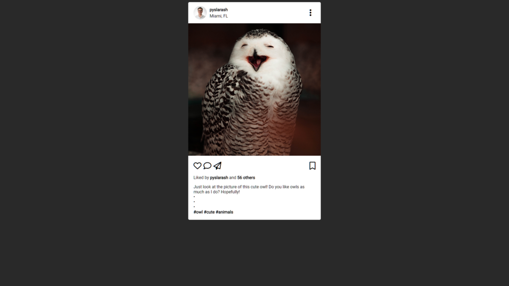
First, let’s begin with a screenshot of the final result:
By the way, this cute photo of an owl was found on the website Pexels, and it was made by the photographer Francesco.
Breakdown
Let’s break down the project piece by piece like I’ve done before.
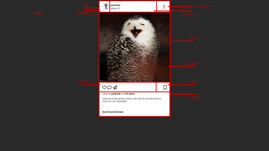
As you might see in this breakdown, we have a few important parts of the Instagram post:
- The <body></body> tag will be responsible for the background and font only
- The .post attribute will hold the post itself, and it will contain certain pieces:
- .top: the top part of the post (think like a header)
- .profile_pic: will contain a profile photo
- .profile_txt: will contain the profile name and location
- .navigation: will contain a three-dotted navigation icon
- .image: will contain an actual image of the post
- .footer: will have everything located under the image
- .first-3: will contain the left three icons under the photo (like, comment, and share)
- .save: will have a save icon
- .footer: will contain a few paragraphs with “who liked the photo”, description, and hashtags
- .top: the top part of the post (think like a header)
Let’s begin with an in-depth explanation of the project.
General Things
Let me describe everything to you as I did in the digital postcard and photo feed. We might have a lot of similarities between these projects.
I wanted to mention that I added Font Awesome icons to this Instagram post to create the like, share, and other icons. This is how I connected it:
<script src="https://kit.fontawesome.com/d40adb1550.js" crossorigin="anonymous"></script>Also, I utilized a Google font Roboto in this project:
<link rel="preconnect" href="https://fonts.googleapis.com">
<link rel="preconnect" href="https://fonts.gstatic.com" crossorigin>
<link href="https://fonts.googleapis.com/css2?family=Roboto&display=swap" rel="stylesheet">
And this is how I added it to the CSS:
body {
    background-color: #292929;
    font-family: 'Roboto', sans-serif;
}
I also set a background color for the whole body of the post.
Instagram Post Structure
As you could see earlier in the picture, the post follows a certain structure. I will leave just the “skeleton” of the breakdown for you to see:
<div class="post">
    <div class="top">
        <div class="profile_pic"></div>
        <div class="profile_txt"></div>
        <div class="navigation"></div>
    </div>
        <div class="image"></div>
   <div class="footer">
       <div class="icons">
           <div class="first-3"></div>
           <div class="save"></div>
       </div>
   </div>
</div>
I already described what each class does here. Now, let’s take a look at the CSS code to see how it’s adjusting the HTML look.
The Header
This is the look of the .top class in CSS:
.top {
    padding: 10px 30px 10px 20px;
    height: 60px;
    display: flex;
    justify-content: right;
    align-items: center;
}
As you can see, it has some padding values, a fixed height of 60 pixels, display: flex parameter that puts children <div></div> in a line, and some basic alignment parameters.
Further, the .top class has three other divs inside: .profile_pic, .profile_txt, and .navigation.
This is the CSS of .profile_pic:
.profile_pic {
    width: 55px;
    height: 55px;
    display: flex;
    justify-content: center;
    align-items: center;
}
This class pretty much created a border around the picture that I placed inside. And this is the HTML for the picture:
<img class="profile_img" src="./pics/img.jpg">It has its own class, .profile_img that is reflected in this CSS code:
.profile_img {
    width: 50px;
    height: 50px;
    object-fit: cover;
    border-radius: 50%;
    margin: 0px;
}
In order to make the profile picture a circle, I used a border-radius of 50%.
Going further, let’s take a look at .profile_txt‘s CSS:
.profile_txt {
    width: 20%;
    margin: 5px 5px 5px 10px;
    align-items: center;
}
As you can see, we have certain margin parameters and a width of 20%. The HTML of that div contains a few paragraphs:
<p class="profile_name"><a href="https://www.instagram.com/pyslarash/" target="_blank">pyslarash</a></p>
<p class="location">Miami, FL</p>
The paragraphs feature their own classes of .profile_name and .location. These are the CSSs for both of them:
.profile_name {
    font-weight: bold;
    margin: 0px;
}
.location {
margin-top: 5px;
margin-bottom: 0px;
}The .profile_name was made bold, and the .location had a margin of 5 pixels from the top. Also, this is them both being applied the same style to:
.profile_name, .location {
    display: flex;
    justify-content: left;
    align-items: center;
}
Moving further, let’s take a look at .navigation. This is the HTML of the three dots that were placed in it:
<i class="fa-solid fa-ellipsis-vertical"></i>It’s just a piece of the Font Awesome. However, the .navigation is also a container that stores these three dots. This is the CSS of it:
.navigation {
    width: 70%;
    text-align: right;
    margin: 5px;
    font-size: 30px;
}
As you see, it has a rather big width of 70% and the text is aligned on the right.
The Image
Well, this is probably the simplest part of the Instagram post: the picture. This is the HTML line of the image itself:
<img src="./pics/owl.jpg">It is being stored locally in the /pics directory. And this is the CSS of the .image class:
.image {
    margin: 0px;
    height: 500px;
    width: 500px;
    object-fit: cover;
	  object-position: top;
}
As you see, it has a margin of 0 pixels, and the photo itself is 500×500 pixels.
Note: I created a squared picture beforehand.
The Footer
Now, let’s move to the bottom part of the Instagram post, the footer. The CSS of the class .footer features only the padding of 20 pixels:
.footer {
    padding: 20px;
}
However, there are other pieces that are included there. For example, the icons. The div that contains the class .icons has two children inside of it. I had to pit them in a single line instead of a column:
.icons {
    font-size: 30px;
    display: flex;
}
The display: flex parameter helped me to achieve it.
The two children that I was talking about are .first-3 and .save:
.first-3 {
    width: 50%;
}

.save {
    width: 50%;
    text-align: right;
}
As you see, I set the font size of the Font Awesome icons via the .icons class, and I used the children only to set the alignment and width.
This is how they look in the HTML:
<div class="icons">
    <div class="first-3">
        <i class="fa-regular fa-heart"></i>
        <i class="fa-regular fa-comment"></i>
        <i class="fa-regular fa-paper-plane"></i>
    </div>
    <div class="save">
        <i class="fa-regular fa-bookmark"></i>
    </div>
</div>
Let’s move a bit down. The HTML will feature two paragraphs: one for the likes and another one for the description and hashtags:
<p>
   Liked by <span class="bold"><a href="https://www.instagram.com/pyslarash/" target="_blank">pyslarash</a></span> and <span class="bold">56 others</span>
</p>
 <p class="description">
   Just look at the picture of this cute owl! Do you like owls as much as I do? Hopefully!<br>
   •<br>
   •<br>
   •<br>
   <span class="bold"><a href="https://www.instagram.com/explore/tags/owl/" target="_blank">#owl</a> <a href="https://www.instagram.com/explore/tags/cute/" target="_blank">#cute</a> <a href="https://www.instagram.com/explore/tags/animals/" target="_blank">#animals</a></span>
</p>
Here I created a <span></span> hashtag with a class .bold and used it to make certain parts of the text bold via the CSS:
.bold {
    font-weight: bold;
}
Also, the second paragraph features a class .description that only has a margin of 0 pixels in the CSS code:
.description {
    margin: 0px;
}
Additional Features
This Instagram post also features a few additional things in the CSS:
a:link, a:visited, a:active {
    color: black;
    text-decoration: none;
}

a:hover {
    color: #292929;
    text-decoration: none;
}
I was playing with the look of the links when you hover over them and when they are inactive, active, or visited. I removed all of the underlining and set the color for the hover at HEX of #292929.
Conclusion
As you see, it was a rather simple project, yet, CSS helped to create a good-looking Instagram post. Truly, HTML without it would look quite ugly, and pages would’ve been styled like they were back in the 90s or early 2000s.
Again, if you have any questions, feel free to leave them in the comments below.


